

- By Wrenlocal
- Google Maps Rankings
Quick answer: a Google Maps ranking map (also called a local SEO heatmap or geo-grid) shows where your business ranks in Google Maps from many different spots around you. Each circle is one search, run as if a customer were standing at that spot, and the color shows how well you rank there: green for the top three, amber for fourth to tenth, red for lower, grey for not found. Read it by looking at the shape of the colors, the share of green, and where the gaps are.
That is the short version. This guide is the long one: what every part of the map means, why it changes from block to block, how the three scores (SoLV, ARP and ATRP) are worked out with a real example you can follow, six patterns you will see and what to do about each, and the limits of the whole thing.
- What a ranking heatmap is, and what it is not
- Why you rank differently from place to place
- Anatomy of a ranking map
- What the colors mean
- The three scores, worked out by hand
- Six patterns and what to do about each
- How to set up a grid that tells the truth
- Read your own map in 10 minutes
- What to do next
- How accurate is it?
- Frequently asked questions
What a ranking heatmap is, and what it is not
If you search for your own business from your office, you will probably see yourself near the top. That tells you very little. Google shows different businesses to different people depending on where they are, so one search from one spot is not the whole picture. A ranking map fixes that by repeating the same search from a grid of spots around your service area and recording where you appear at each one.
Two things worth knowing:
- It is not a Google product. Google does not publish a map like this for your business. The maps come from third-party rank tracking tools, which is why they are called rank trackers or geo-grid trackers. They simulate a search from each coordinate.
- It is not the same as a “Google Maps heatmap” for developers. If you searched that phrase and landed on programming documentation, that is a way of drawing data on a map, not a ranking report.
Why you rank differently from place to place
Google says local results are based mainly on three things: relevance (how well your profile matches what was searched), distance (how far your business is from the person searching) and prominence (how well known your business is, including reviews and what Google knows about you from around the web). Google does not publish how much each one counts, and it says there is no way to pay for a better local ranking.
On a ranking map, distance is the one you see most clearly. Relevance and prominence are about your business and stay roughly the same everywhere. Distance changes with every circle. That is why the map usually looks strongest around your address and fades outward.
If you work at customers’ homes
Most contractors are service-area businesses: you travel to the customer. Google asks service-area businesses to hide their address if customers do not visit it, and lets you list up to 20 service areas, with the whole area no more than about two hours’ drive from your base. One important point: Google’s help page describes the service area as a way to show where you work. It does not say a larger service area makes you rank farther from your address, so do not expect it to. Practitioners who write about this commonly note that the top results tend to come from businesses within a few miles of the searcher.
Anatomy of a ranking map
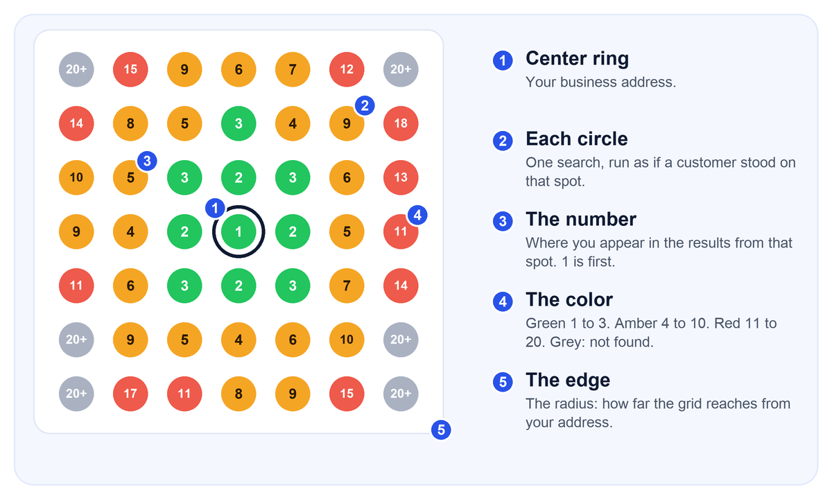
Every map has the same five parts:
- The center. Your business address, the point the grid is built around.
- Each circle. One search for one keyword, run as if a customer stood at that spot. A 7 by 7 grid is 49 searches.
- The number. Your position in the results from that spot. 1 is first.
- The color. A quick read of that number. Grey or “20+” means you did not appear in the results that were checked.
- The edge. The radius is how far the grid reaches. A radius that is too big pulls in places you would never work, and a radius that is too small hides the places you do.
Every map is also tied to one keyword and one date. “Fence contractor” and “fence installation” can give different maps, and the same map a month later will not be identical.
What the colors mean
Green for the top three is the same everywhere, because those are the three businesses Google shows in the map pack. Past that, tools and guides disagree on where amber ends and red begins:
| Source | Green | Amber / yellow | Red |
|---|---|---|---|
| Our reports | 1 to 3 | 4 to 10 | 11 to 20, grey for not found |
| Some guides | 1 to 3 | 4 to 7 | 8 and lower |
| Other guides | 1 to 3 | 4 to 6 | 7 and lower |
| Local Falcon | Dark green is roughly the top three | Yellow and orange are lower | Red is “virtually invisible” (its wording) |
So when a report is “mostly amber,” ask what amber means on that report. We use 4 to 10 as the “findable if they scroll” band. That is our own convention, so always read the legend on the report in front of you.
The three scores, worked out by hand
Most reports boil the map down to a few numbers. Three come up again and again. Different tools use different names, and Local Falcon has a trademark on “Share of Local Voice,” so we will call the first one SoLV, the way many people do.
- SoLV (share of local voice): the percentage of grid spots where you are in the top three. It is the number of green spots divided by the total.
- ARP (average rank position): your average position across only the spots where you appear.
- ATRP (average total rank position): your average position across every spot, with a stand-in number used for the spots where you did not appear.
The best way to see the difference is to calculate them. Here is the grid from Figure 1 as a table. Green is 1 to 3, amber is 4 to 10, red is 11 to 20, grey is not found.
| 20+ | 15 | 9 | 6 | 7 | 12 | 20+ |
| 14 | 8 | 5 | 3 | 4 | 9 | 18 |
| 10 | 5 | 3 | 2 | 3 | 6 | 13 |
| 9 | 4 | 2 | 1 | 2 | 5 | 11 |
| 11 | 6 | 3 | 2 | 3 | 7 | 14 |
| 20+ | 9 | 5 | 4 | 6 | 10 | 20+ |
| 20+ | 17 | 11 | 8 | 9 | 15 | 20+ |
Step 1: count the spots. The grid has 49 spots. 10 are green, 22 are amber, 11 are red and 6 are not found. (10 + 22 + 11 + 6 = 49.)
Step 2: SoLV. 10 green spots out of 49 is 10 ÷ 49 = 20.4%.
Step 3: ARP. 43 spots show a rank. Add up those ranks and you get 326. Divide: 326 ÷ 43 = 7.6.
Step 4: ATRP. The 6 spots where we did not appear need a stand-in number. We use 21, one past the last position checked. (Tools use their own default, so compare ATRP only within the same tool.) That adds 6 × 21 = 126 to the 326, for 452. Divide by all 49 spots: 452 ÷ 49 = 9.2.
We did not find an official benchmark for a “good” score, so be wary of anyone who gives you one. A better test is your own history: is SoLV higher than last month, and which spots changed color?
Six patterns and what to do about each
Look at the shape before you look at the numbers. Most maps fall into one of six patterns. These are common explanations, not diagnoses, so use them to decide what to check first.
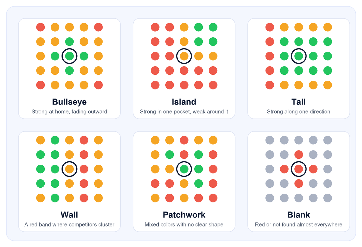
1. Bullseye: strong at home, fading outward
What it means: this is the most normal pattern, and it is mostly distance at work. You are fine near your address and lose out where competitors are closer to the customer.
What to do: improve prominence so you can hold ground farther out. Build up reviews and keep replying to them, complete every part of your profile, and give each main service its own page on your website. Do not expect a perfect green map across a big area.
2. Island: strong in one pocket, weak around it
What it means: a cluster of green that does not touch your address. Often there is a gap in competition there, or a competitor’s strength sits in between.
What to do: find out what is different about that pocket. Is there little competition? Do you have jobs and reviews from that area? If it is a place you want more work, put its name on a service page and ask customers there for reviews.
3. Tail: strong in one direction
What it means: green extends along one side, often following the direction where you get your work or where competitors are thin.
What to do: check the opposite side. If competitors are clustered there, your gap may be competition rather than a problem with your profile.
4. Wall: a red band across the middle
What it means: strong on both sides but weak in a strip. This often means a group of strong competitors sits there, or the strip is a place with few customers.
What to do: look at who ranks in the red strip, and compare their reviews, categories and photos with yours. If the strip is a river, a highway or empty land, ignore it, or remove those spots from the grid.
5. Patchwork: mixed colors with no shape
What it means: green, amber and red scattered with no pattern. This can come from a broad keyword, a grid set too tight, or ordinary day-to-day movement in the results.
What to do: run the scan again with the same settings, and try a more specific keyword. Judge it by the average over a few scans, not one.
6. Blank: red or not found almost everywhere
What it means: this is the one that needs attention first. Common causes are a primary category that does not match the search, a very new profile, an incomplete profile, or a profile with a problem such as a suspension.
What to do: check the basics before anything else: the primary category, that your profile is verified and active, and that you searched for a keyword customers really use.
How to set up a grid that tells the truth
A map is only as useful as its setup. A few rules:
- Match the radius to how far you really drive. Local Falcon suggests starting at about 2 miles in dense cities, about 5 in suburbs and about 10 in rural areas.
- Pick a grid size you can read. 5 by 5 to 9 by 9 are common. More spots give more detail and cost more.
- Remove spots where you would never work. Local Falcon advises dropping points over water, mountains or empty land, because they make your coverage look worse than it is.
- Scan the words customers use. Use the service plus the way people search, such as “fence contractor” or “paver installation,” not your company’s internal name for the service. Two to five keywords is enough.
- Do not change the settings. Keep the same keywords, grid and radius each month so the maps are comparable.
| Where you work | Starting radius | Suggested grid |
|---|---|---|
| Dense city | About 2 miles | 7 by 7 |
| Suburbs | About 5 miles | 7 by 7 |
| Rural or large territory | About 10 miles | 7 by 7 or 9 by 9 |
The radius figures come from Local Falcon’s guidance. The grid size is our suggestion for a first scan. Adjust both after you see the first map.
Read your own map in 10 minutes
- Check the setup first. What keyword, what radius, what date? If it is not a search your customers use, the rest does not matter.
- Look at the shape. Which of the six patterns is it?
- Count the colors. How many green, amber, red and grey? Work out SoLV (green ÷ total).
- Find the biggest gap. Which part of your service area is red or grey that you want more work from?
- Check your own address. Are you green at the center? If not, fix that before anything else.
- Look at who beats you. In two or three red spots, see who ranks first and why: more reviews, a better category, closer.
- Ignore spots you would never serve. Water, highways, empty land.
- Compare with last time. What changed color since the last scan?
- Pick one thing to fix this month. Not ten.
- Note the date to scan again.
What to do next
Work from the cause, in this order:
- Primary category and profile. Choose the category that matches your main service and add the fewest, most specific others that really apply (Google’s own guidance). Fill in services, hours and a description.
- Consistent details. Your name, address and phone number should match on your website and in the directories where you are listed.
- Reviews. Ask happy customers right after a job, and reply to the reviews you get. Google lists reviews as part of prominence. Never buy or trade for them.
- Service pages. Give each main service its own page that names the places you serve. Whitespark’s experts rank dedicated service pages first for the regular results.
- Rescan on a schedule. Same settings, same keywords, so you can see what moved.
Be patient with the timing. A new or weak profile can take months to turn red into green, and it moves more slowly in busy trades and big cities. Results vary by industry, city, and local competition.
How accurate is it?
Be careful not to treat the map as more than it is:
- It is a simulation. The tool searches as if someone were standing at each coordinate. That is a good way to see a pattern, but it is not a recording of what a real customer saw.
- Results are personalized. Local SEO specialists at Sterling Sky point out that results vary with location and search history, and one of their clients got clicks from 169 different keywords in a year, far more than any tracker can follow. Your own phone showing you first is not proof.
- It moves. Rankings change from day to day. Treat one scan as a snapshot.
- Tools disagree. People in the Local Search Forum report different accuracy from different tools, and we did not find a vendor accuracy guarantee.
- It does not guarantee calls. We did not find independent evidence that a higher SoLV means more calls. Treat the map as a way to find problems, and judge results by calls, direction requests and jobs from your Google Business Profile Performance report.
Frequently asked questions
What does green, amber and red mean on a local SEO heatmap?
Green means you show up in the top three results from that spot, amber means you are somewhere from fourth to tenth, and red means you are further down the list. Grey or “20+” means you did not appear in the results that were checked. Only green for positions 1 to 3 is the same everywhere. Tools differ on where amber ends and red begins, so check the legend on your own report.
What is a good SoLV (share of local voice) score?
There is no official benchmark, and we did not find an independent study that defines one. As a rule of thumb, compare your own score month to month, and compare it to the competitor that outranks you on the same grid. A new profile with a low score that rises each month is making progress. A high score that falls is a warning.
What is the difference between ARP and ATRP?
Average rank position (ARP) averages only the spots where you appear in the results. Average total rank position (ATRP) also counts the spots where you do not appear, using a default value in place of a rank. ARP can look good while many spots are empty. ATRP and the share of spots in the top three give a more honest picture.
Does Google have a ranking heatmap?
Not for your business rankings. Google does not publish a map showing where you rank from every spot around you. These maps come from third-party rank tracking tools that run many searches from different coordinates. If you searched for “Google Maps heatmap” and found developer documentation, that is a different thing: a way to draw data points on a map.
Why do I rank first near my shop but not across town?
Google uses distance as one of its three main local ranking factors, along with relevance and prominence. A customer who is closer to a competitor’s address will often see that competitor first. You can improve relevance and prominence, but you cannot change where the customer is standing.
How often should I run a ranking scan?
No tool vendor we found gives an official recommendation. What matters more is consistency: use the same keywords, the same grid and the same radius each time so you are comparing like with like. We run it monthly, because Google results move day to day and a single scan is only a snapshot.
What grid size and radius should a contractor use?
Start from how far you actually travel for jobs. Local Falcon, a rank tracking tool, suggests a radius of about 2 miles in dense cities, about 5 in suburbs and about 10 in rural areas. Grids from 5 by 5 to 9 by 9 are common. Remove spots over water or empty land, because they make your coverage look worse than it is.
Is a local rank tracker accurate?
It is a simulation: the tool runs a search as if a person were standing at each coordinate. That is a useful way to see patterns, but results are personalized by location and search history, so a real customer may see something slightly different. Treat the map as a diagnostic tool, and judge success by calls, direction requests and jobs.
How do I fix red spots on my map?
First work out which pattern you have. Weak everywhere points to the profile itself, such as the primary category or missing information. Weak in one direction often points to competitors or to being too far from your address. Fix the basics first: the primary category, complete services and descriptions, consistent business details, reviews, and a website page for each main service.
Do ranking heatmaps predict how many calls I will get?
We did not find independent evidence that they do. Vendors say a higher share of top-three spots should mean more visibility, which is reasonable, but calls also depend on your reviews, photos, hours and the season. Check your Google Business Profile Performance report for calls over time.
See your own map
The fastest way to learn to read a ranking map is to look at yours. Get your free ranking report and we will run the scan for your business and send you the map. If you decide you want help fixing what it shows, our fully managed local SEO is month to month with no setup fee, and the details are on the pricing page.
Sources
- Google Business Profile Help, “Improve your local ranking on Google”: support.google.com/business/answer/7091
- Google, guidelines for representing your business: support.google.com/business/answer/3038177
- Google, service areas: support.google.com/business/answer/9157481
- Whitespark, Local Search Ranking Factors 2026: whitespark.ca/local-search-ranking-factors
- Local Falcon, how to read a local search grid: localfalcon.com
- Sterling Sky, local rank tracking and monthly reports: sterlingsky.ca/local-rank-tracking
- LeadsNearby, why service-area businesses do not rank everywhere: leadsnearby.com
Last reviewed October 3, 2026. Results vary by industry, city, and local competition.